When Google released the fourth beta of Android 16 this month, many users were disappointed by the lack of major UI changes. As Beta 4 is the final beta, it’s likely the stable Android 16 release won’t look much different than last year’s release. However, that might not hold true for subsequent updates. Google recently confirmed it will unveil a new version of its Material Design theme at its upcoming developer conference, and we’ve already caught glimpses of these design changes in Android—including a notable increase in background blur effects. Ahead of I/O next month, here’s an early look at Google’s upcoming Android redesign.
Before we begin, a word of caution: What we’re about to show you are hidden design changes found in Android 16 Beta 4. None of these are enabled by default in Beta 4, and we don’t know for certain when Google will activate them. While it’s highly likely we won’t see this full redesign in the stable release of Android 16, parts or all of it could appear in a future quarterly update. We’ll hopefully get more clarity next month during The Android Show or Google I/O 2025, where the company plans to unveil its new, more “expressive” version of Material Design, dubbed Material 3 Expressive.
A more subtle change involves the font used for the text clock. It’s now slightly larger and bolder than before, making it marginally easier to read at a glance.
Last year, we reported that Google was preparing a major overhaul of the notifications and Quick Settings area. As part of this redesign, Google planned to split the notifications and Quick Settings panels into separate pages. This split design aimed to create more space for both notifications and tiles but represented a dramatic departure from the current combined layout.
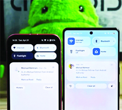
While Google is still refining this split design and might offer it as an option later, the company currently seems to be moving forward with a different approach for the main interface. This newer design keeps the Quick Settings and notifications panel combined but retains many quality-of-life improvements developed alongside the split concept. These include resizable Quick Settings tiles, new one-click toggles for Wi-Fi and Bluetooth, a more organized tile editor, and one-click shortcuts for adding or removing tiles. It also introduces a redesigned brightness slider, downward-facing arrows (instead of rightward) for expandable tiles, and the new segmented Wi-Fi icon mentioned earlier, but the overall layout remains familiar.
Although the basic layout is similar, the look and feel change dramatically. Instead of a solid black background, the panel now displays a blurred version of the content underneath. The blur effect is less intense beneath the Quick Settings tiles compared to the notification area; this helps ensure notifications remain readable even with some transparency applied. When light mode is enabled, the background takes on a frosted glass appearance. In dark mode, the background and toggles shift to a darker gray, with transparency applied to both.
Source: androidauthority


Be the first to comment